
“The form of the Chanel Pavilion is a celebration of the iconic work of Chanel, unmistakeable for its smooth layering of exquisite details that together create an elegant, cohesive whole. The resulting structure is very much tied to that original inspiration—elegant, functional, and versatile both in its overall structure and detail.
The form of the Chanel Pavilion is a celebration of the iconic work of Chanel, unmistakeable, for its smooth layering of exquisite details that together create an elegant, cohesive whole. The resulting structure is very much tied to that original inspiration—elegant, functional, and versatile both in its overall structure and detail.
The architectural structure of the Pavilion is a series of continuous arch-shaped elements, with a courtyard in its central space. The glazed ceiling adjusts to allow for control of the interior temperature in response to the particular climate conditions of each venue city.
Natural light descending from seven elements on the ceiling, meets artificial light pushed up from gap between the walls and raised floor to emphasize the “arched” structure, and assists in the creation of a new artificial landscape for art installations. Six of these elements are roof lights for artworks; another large opening dramatically floods the entrance in daylight to blur the relationship between interior and exterior. In addition to the lighting and colour effects, the spatial rhythm created by the seams of each segment gives strong perspective views throughout the interior.
The size of the Pavilion will be 29m x 45m, a total of 700sqm. The overall height is 6m, with the floor raised 1.00m above the existing ground surface. In light of the extensive shipping between cities, each structural segment will be a maximum of 2,25m wide.
The 65sqm central courtyard has large transparent openings to the sky above and is designed to host events as well as provide an area for reflection after visiting the exhibition. The courtyard serves as an intermediate space between the exhibition and a public area of the Pavilion. A 25sqm cloakroom is also provided.
With a direct visual connection to the courtyard, the 128sqm terrace continues this dialogue between the Pavilion’s exterior and interior. During an event, the two spaces could be linked to become one large event zone
Reflective materials allow the exterior skin to be illuminated with varying colours which can be tailored to the differing programmes of special events in each city.
The dichotomy between the powerful sculptural mass of the Chanel Pavilion’s structure and the lightness of its envelope create a bold and enigmatic element. The Pavilion’s exterior develops into a rich variety of interior spaces that maximize the potential to reuse and rethink space due to the innate flexibility of its plan.
The total fluidity of the Chanel Pavilion’s curvilinear geometries is an obvious continuation of Hadid’s 30-years of exploration and research into systems of continuous transformations and smooth transitions. With this repertoire of morphology, Zaha Hadid is able to translate the ephemeral typology of a pavilion into the sensual forms required for this celebration of Chanel’s cultural importance.
sources:
Link 1,
Link 2,
Link 3
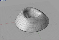
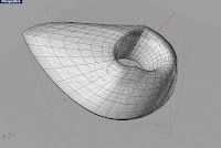
 From its central axis, the practice created a polar grid that divides the torus into 36 segments each of 10 degrees.
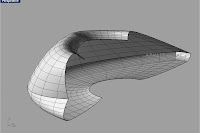
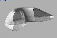
 This pavilion is made up of hundreds of moulded fiber reinforced plastic (FRP) mounted on a skeletal steel frame. Each piece had to fit together like a giant jig-saw puzzle. Width of each panel dose not exceed 7.38 feet, packed in 51 shippable containers.


